St.Ives
•
St.Ives •
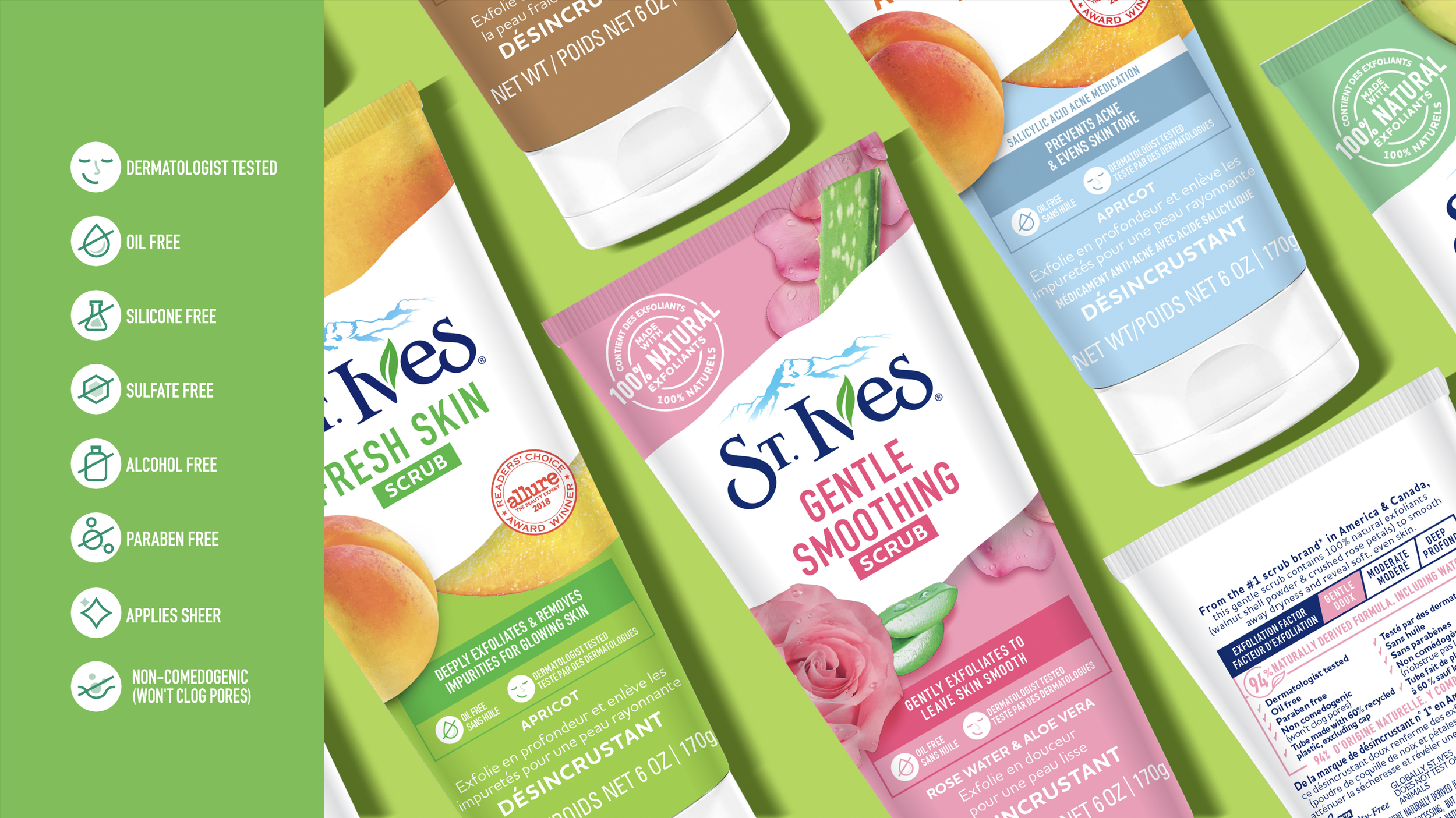
Updated the St.Ives packaging portfolio to be dual-language (adhering to bill96) while simplifying the ingredient imagery & architecture.
Designed a suite of icons to live in an organized benefit fox to be used as consistent assets throughout the range.
Extended the portfolio to introduce a new line of products directed toward acne prone skin, adapting to new formats — answering the question — how to make this line look new and different, but also stay within the St.Ives world?
this work was done in collaboration with the team at 1HQ