Q-tips
2024 Rebrand
The 1HQ Team and I developed the 2024 rebrand for Q-tips. The brief was to modernize a category icon & make Q-tips stand out from the private label cotton swab brands while reinforcing quality.
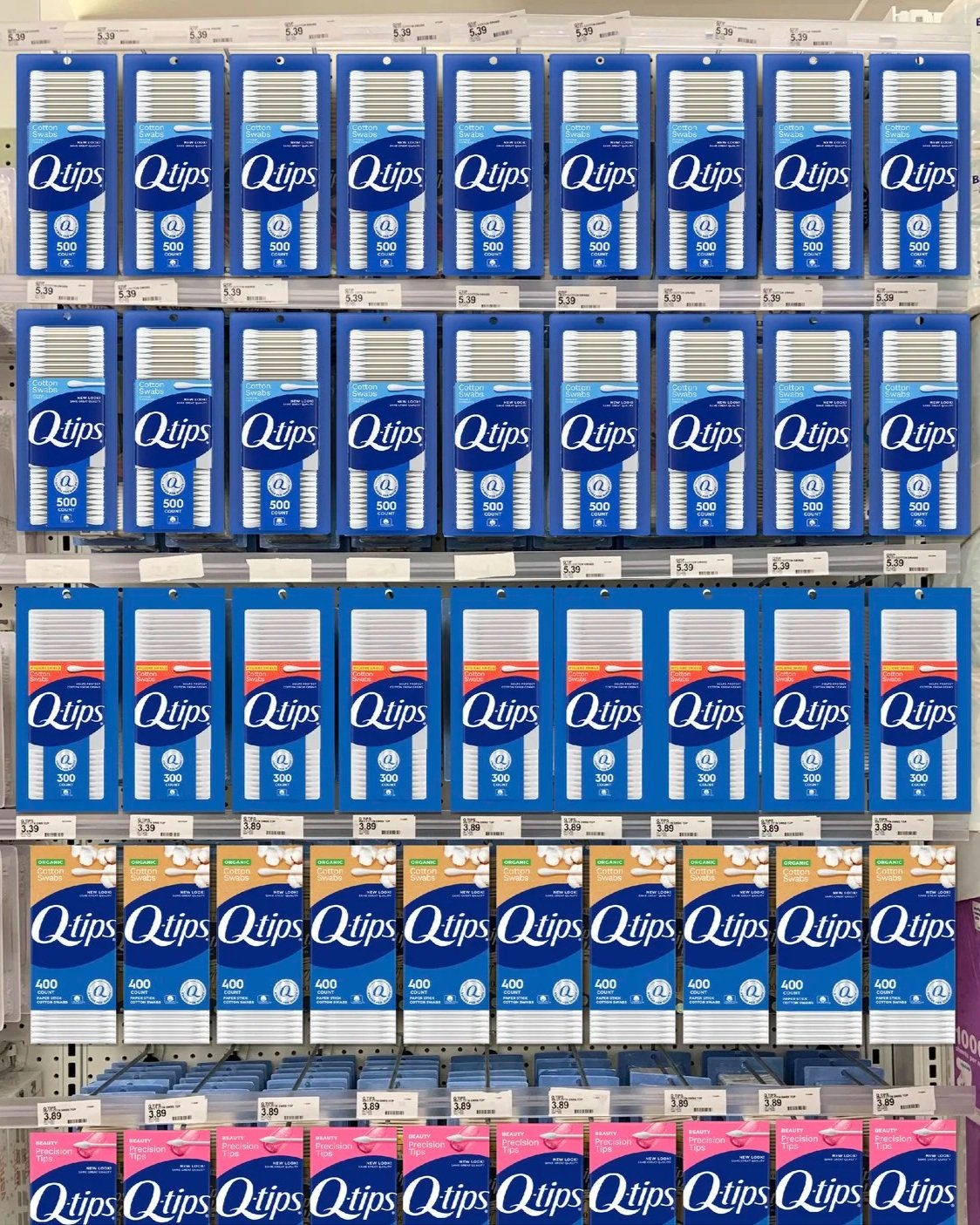
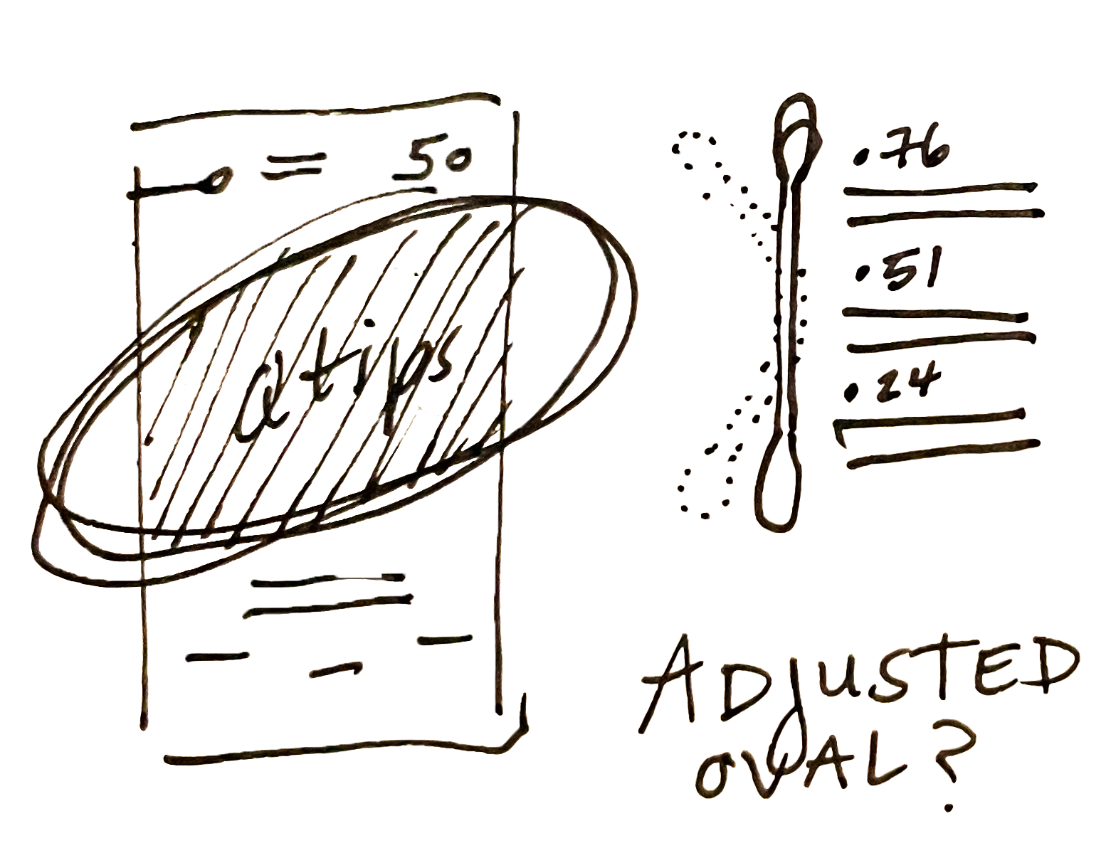
I led the packaging redesign, prioritizing the simplicity and scale of the logo —creating an unmissable brand block at shelf.
Design Strategy
Packaging Design
Logo Optimization
Brand Guideline
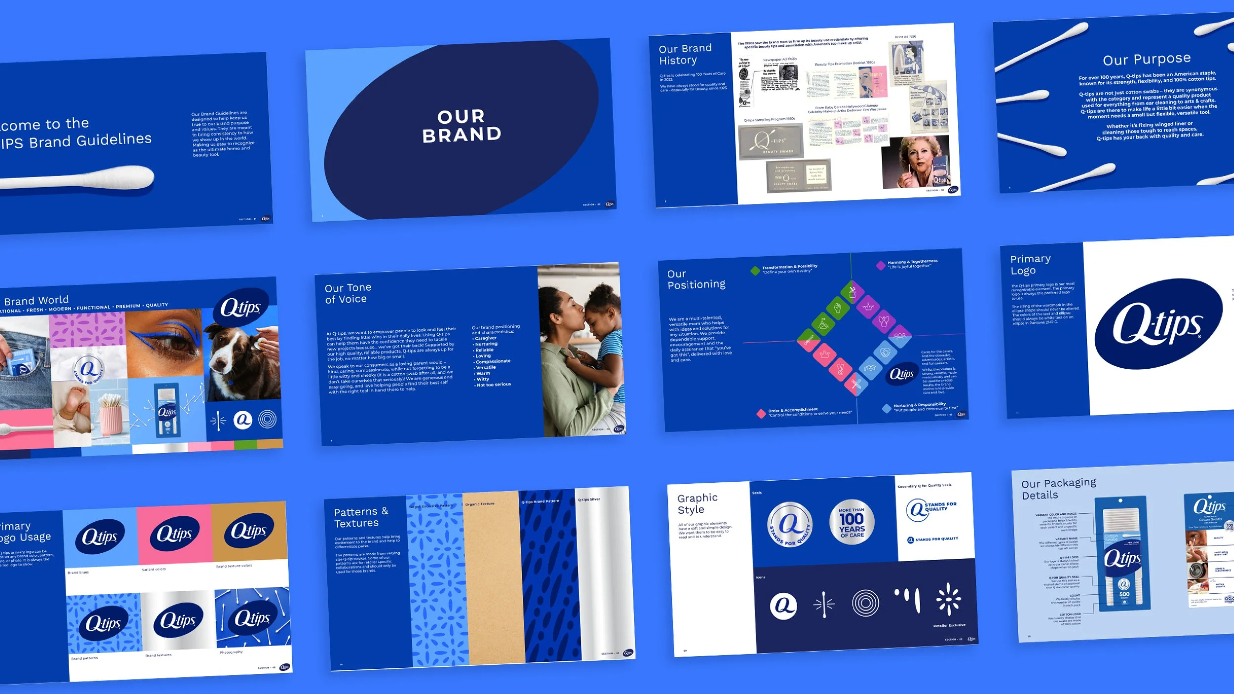
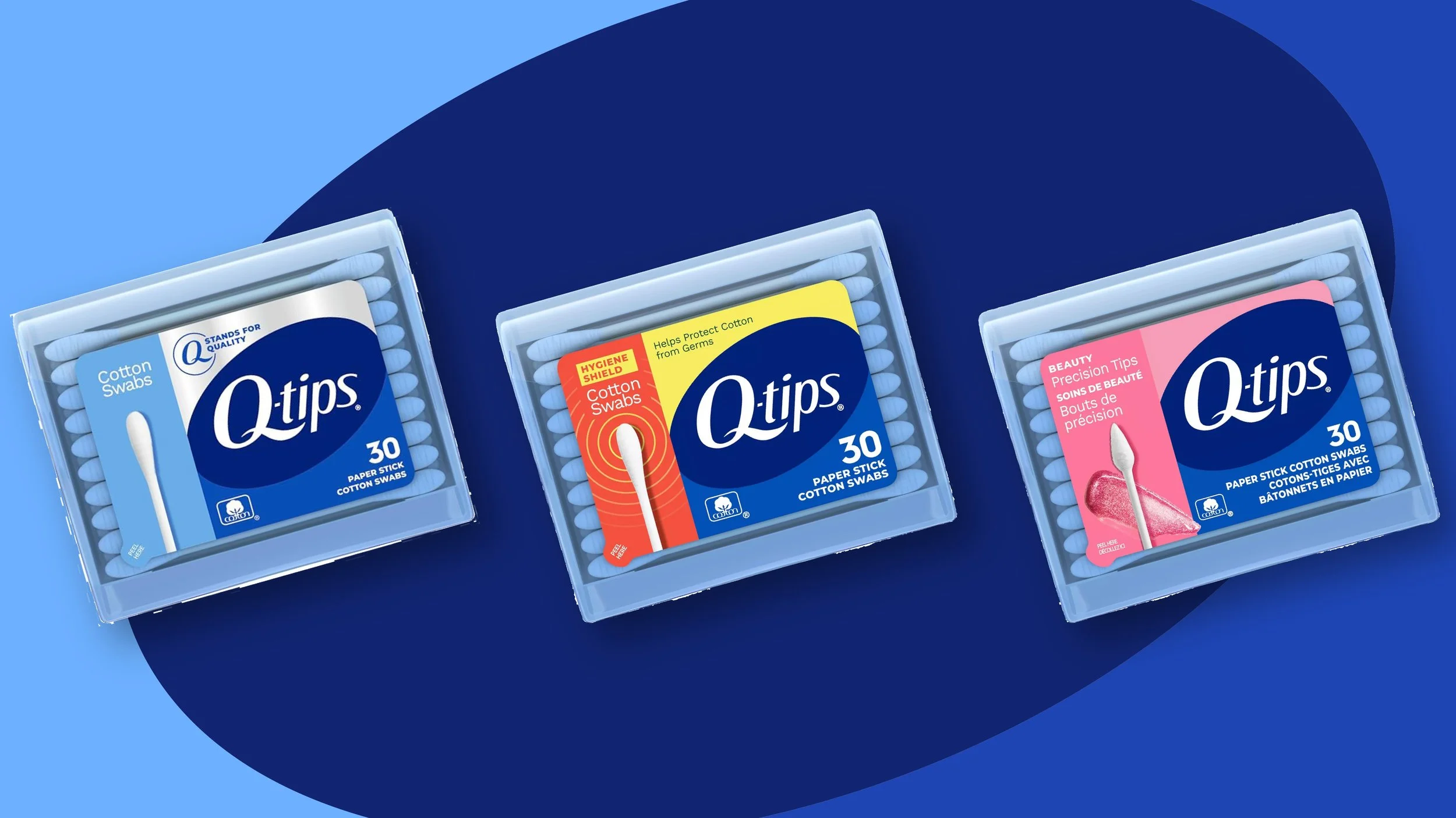
We extended the look and feel to all of the products across the US and CA and updated the brand guideline to include more bespoke colors, patterns and icons. Continuing to bring the brand to life on and off pack.

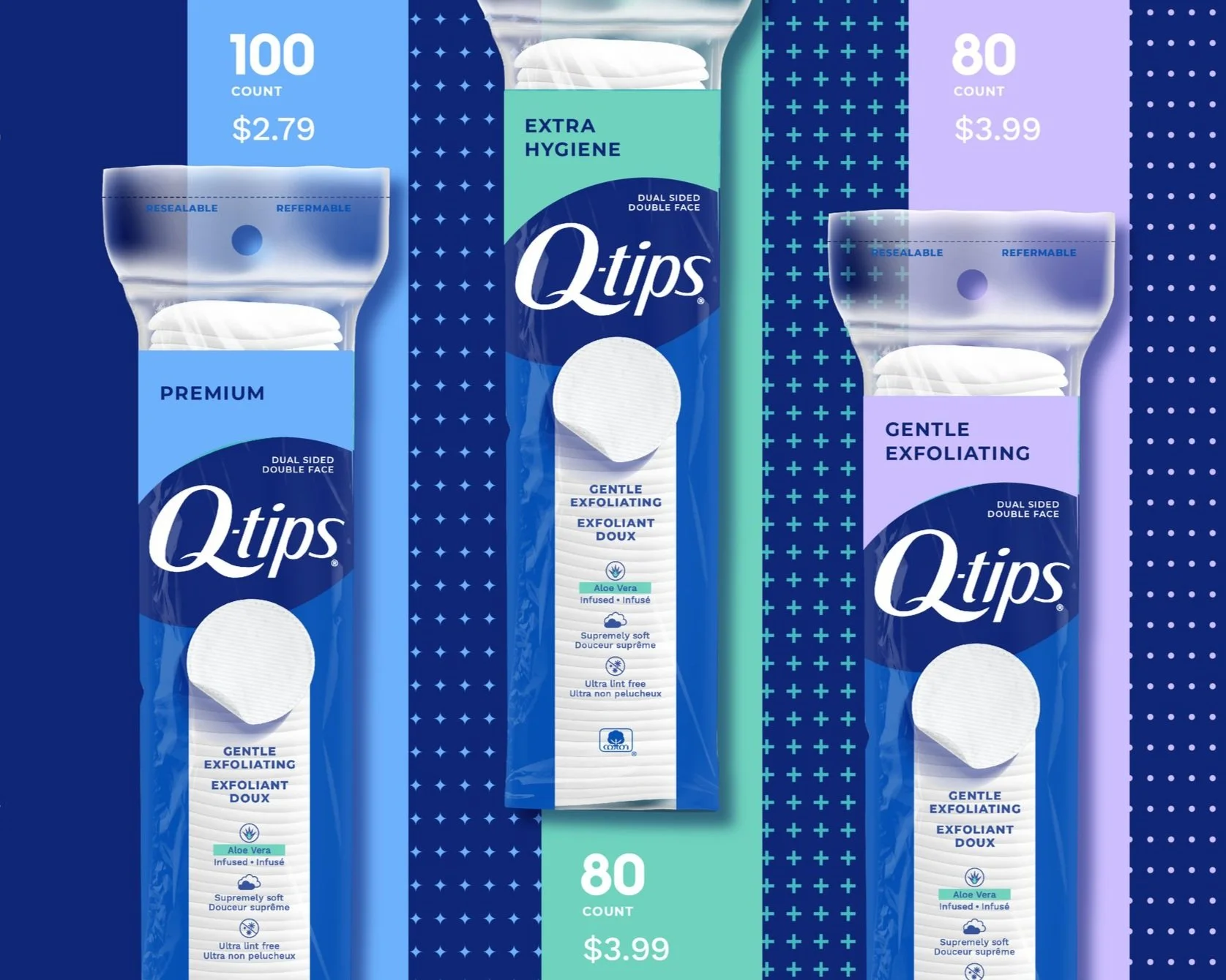
Bright color blocking and product photography help to differentiate the product offerings

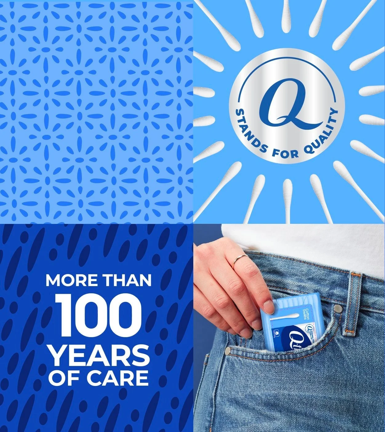
The silver seal reading “Q stands for quality” educates the consumer about the brand.
I created brand patterns inspired by the marks you could make with a Q-tip